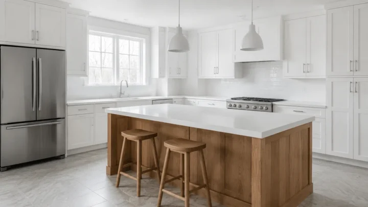
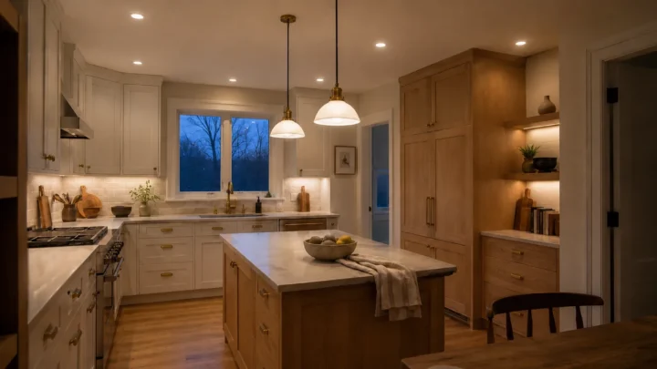
Beige still earns its place in a home, but it no longer has to carry every room that needs a quiet backdrop. For fall 2026, the more interesting alternative may be a family of low-saturation greens softened with gray, brown, or tan: colors that hold the room together like a neutral while giving wood, stone, and autumnal textiles more definition.
The timing is notable. Major paint forecasts have been moving through smoky jade, yellow-green, gray-green, eucalyptus, and khaki, while the newest announcement looks even earthier. Behr’s Grounded, announced on August 26, 2026, as its 2027 Color of the Year, is a mossy olive with brown undertones. It arrives just as fall rooms begin to favor deeper woods, heavier fabrics, and warmer light.
That does not prove beige is finished, nor does it make every sage paint a neutral. It does suggest a useful direction: the safest-looking wall color can carry a trace of green and still remain calm enough for everyday living.
Why muted green can work like a neutral
A useful neutral does more than disappear. It gives the fixed parts of a room a workable relationship. Beige usually does this by repeating warmth already present in wood, woven fibers, and cream stone. A muted green can connect those same warm materials while also answering cooler notes in marble, brushed metal, charcoal, or a gray view outside the window.
The result is often more layered than beige but less demanding than a recognizable accent color. Oak looks warmer against a quiet gray-green. Walnut gains separation beside lichen or eucalyptus. Off-white trim appears intentional rather than merely brighter than the wall.
Current forecast palettes support that range rather than one single “it” shade. Benjamin Moore places the steely, gray-undertoned Raindance 1572 in its neutral family and its 2026 trend palette. PPG selected the more visibly yellow-green Secret Safari for 2026, while Valspar chose the deeper Warm Eucalyptus. Together, they show paint brands positioning green across a broader spectrum of background colors, rather than treating it only as an accent.
The distinction matters. Raindance has a listed light reflectance value, or LRV, of 43.47; Warm Eucalyptus is substantially deeper at 21. LRV describes the percentage of visible light a surface reflects on a zero-to-100 scale. It does not reveal the undertone, guarantee that a room will feel larger, or tell you whether a color will remain quiet beside your floor.

Four green-tinged neutral families worth testing
1. Khaki-stone: the shortest step away from beige
Khaki-stone keeps enough tan or brown in the mixture to feel familiar. It is the easiest starting point for a room built around warm oak, oatmeal upholstery, cream ceramics, or sandy stone. From a distance, it may read as an earth-toned neutral; the green becomes clearer only beside a conventional beige.
Best use: connected living and dining spaces where a strongly colored wall would interrupt the view.
Watch for: very warm bulbs or yellowed flooring. Together they can pull a balanced khaki toward muddy mustard. Compare it with the floor after sunset, not just with a paint card in daylight.

2. Lichen putty: warm, chalky, and quietly old-world
Lichen putty sits between mineral beige and softened olive. Its gray or chalky component keeps the green from becoming grassy, while a small amount of warmth helps it sit comfortably beside aged brass, limestone, medium wood, and softly patterned textiles.
Best use: entries, studies, and rooms with modest architectural detail. It can make simple trim more noticeable without the sharp contrast of a dark color.
Watch for: orange-red oak or cherry. Green can intensify the red in those woods through contrast. A browner, less yellow lichen may sit more comfortably than a classic olive.

3. Gray-sage: the tailored option for warm daylight
Gray-sage has less yellow and a cooler, quieter finish. In a bright south- or west-facing room, that restraint can prevent the walls from becoming too sweet or golden. It works especially well beside pale stone, soft white, white oak, charcoal, and restrained black details.
Best use: bright living rooms and bedrooms that already receive plenty of warmth from sun, flooring, or textiles.
Watch for: a cool north-facing room. Blue-gray components can become more obvious in indirect light, leaving the paint colder than the sample suggested. Move one step toward lichen or browned sage before assuming the room needs a lighter version of the same cool color.
4. Muted eucalyptus: a background color with more presence
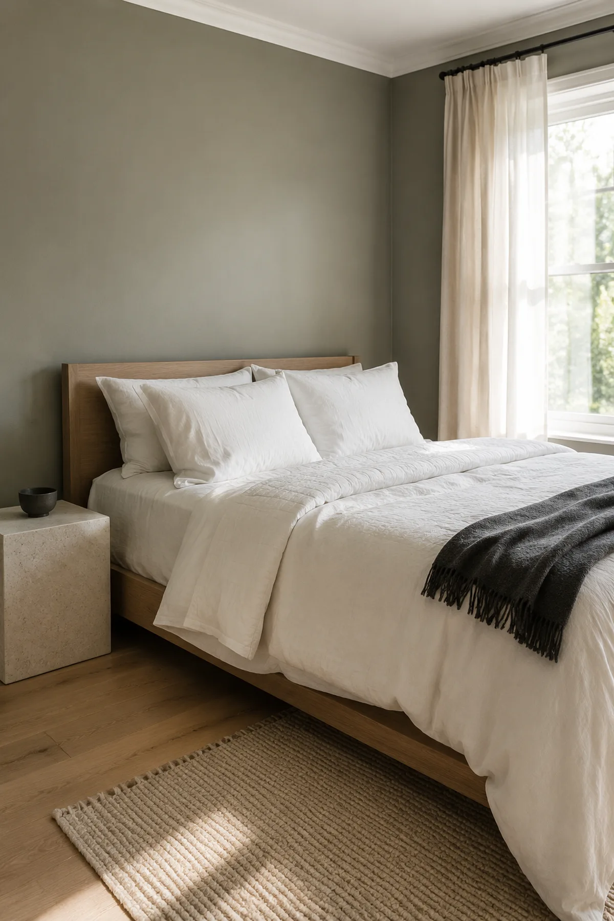
Eucalyptus is the most visibly green member of the group. A muted version can still function as a background, but it brings more depth and may feel enveloping rather than pale and expansive. Warm wood, rust, clay, subdued burgundy, cream, and aged metal keep it grounded for fall.
Best use: a contained dining room, bedroom, built-in, or study where a stronger wall color will not compete with several adjoining palettes.
Watch for: assuming “muted” means light. Some eucalyptus and smoky jade paints have relatively low LRVs and will absorb much more light than many pale beiges. If the sample reads as green before you notice the room, treat it as a color rather than forcing it into a neutral role.

The WA Last Quiet Swatch Method
The hardest decision is rarely beige versus green. It is finding the point where a trace of green gives the room life without becoming a color that every pillow and accessory must answer to.
The WA Last Quiet Swatch Method turns that threshold into a room-specific decision:
- Build a four-swatch ladder. Choose four related samples that move from khaki-stone through lichen and gray-sage toward a clearer eucalyptus. Keep the depth reasonably close so you are comparing the amount and temperature of green, not four unrelated light levels.
- Use separate, movable sample boards. Tiny chips conceal shifts that become obvious across a wall. Paint or order large samples, keep them from overlapping, and move each one beside the room’s floor, largest textile, trim, and dominant stone or wood.
- Check the bright wall and the shaded wall. A sample that looks balanced beside the window may turn blue-gray or muddy in an interior corner. It must work in both places if it will cover the whole room.
- Judge the real evening scene. Switch on the lamps normally used in that room. Do not improve the lighting solely to rescue a paint color that fails during the hours the space is occupied.
- Make the doorway decision. Step into the adjoining space and look back. The last swatch in the ladder that still lets the room, furniture, and materials register before “green wall” becomes the headline is your last quiet swatch.
You may deliberately go one step greener for a cocooning study or a confident dining room. The method simply makes that a color decision rather than an accidental neutral mismatch.
Match the undertone to the light you actually live with
Room orientation is a useful first clue, but it is not a verdict. Trees, neighboring buildings, window size, weather, and bulb temperature can outweigh the compass. The most reliable test happens in the finished room.
In Northern Hemisphere homes, cooler indirect light often makes gray-green paint feel bluer and flatter. A north-facing room may need a lichen, moss, or brown-softened olive to retain warmth. Strong southern light can support a cooler gray-sage. East-facing rooms receive their warmest direct light in the morning, while west-facing rooms receive it later in the day, so both need testing at opposite ends of the day.
Artificial light adds another shift. Warm lamps strengthen yellow, brown, and khaki notes; cooler lamps reveal blue and gray. Behr’s guidance on how lighting changes paint color shows why the same neutral can look creamy under a warm bulb and much crisper under a cooler one. Keep the bulbs you plan to use, then select the paint around that reality.
Let one material repeat the warmth
A green-tinged neutral feels most settled when at least one substantial material carries warmth into the room. That might be an oak floor, walnut table, woven rug, cream upholstery, warm stone, or a restrained clay accent. The repeat does not need to be literal green; its job is to keep the wall connected to the furnishings.
This is especially useful in pale rooms. If an all-white space feels thin, one intentional warm layer may be enough before repainting every surface. Texture and material temperature should do part of the work, leaving paint free to remain nuanced.
Avoid repeating green in every small object. Once the wall establishes the color, stacks of sage pillows, green ceramics, botanical prints, and painted furniture can turn a quiet palette into a theme. One deeper echo—perhaps a striped textile or a darker built-in—is usually more convincing than many exact matches. The same restraint keeps a layered fall living room dimensional instead of crowded.
When beige is still the better choice
Green is not automatically the more sophisticated answer. Beige may serve the room better when the permanent finishes already contain pink, peach, or pronounced red-orange notes that green makes look stronger. It may also be preferable when several adjoining rooms need one continuous, light-reflective background and the furnishings already provide enough color.
Keep beige if every green sample turns noticeably minty, military, gray, or muddy during the hours when the room is used most. A trend should not overrule the fixed materials or the light. For a smaller change, bring the green into one upholstered piece, a painted cabinet, or a patterned textile while the walls remain warm neutral.
The best fall 2026 alternative to beige is therefore not one branded swatch. It is the quietest green that bridges the finishes you already own, survives the room’s real light, and still reads as a background from the doorway. Find that threshold, and the room can feel warmer, more grounded, and more individual without losing the ease that made beige useful in the first place.