

7 Kitchen Cabinet Colour Ideas for 2026: From Aubergine to Sage Without Renovation
Cabinet colour is the single most powerful design variable in any kitchen. Cabinets cover more visual surface than the backsplash, flooring, and countertops combined — meaning the shade chosen sets the entire temperature of the room. In 2026, the palette has moved decisively away from stark whites and cool greys, into warmer, more confident tones with genuine character.
These seven shades are leading that shift — and most require nothing more than a few tins of paint and a free weekend.
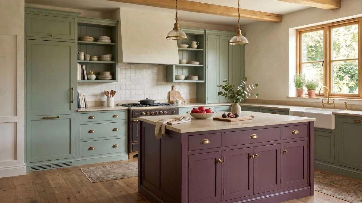
Aubergine — A Statement That Carries the Room

Interior designer Ben Kempton of 202 Design describes aubergine as carrying “an understated opulence that makes an immediate sense of atmosphere.” The deep purple-brown tone is part of a broader return to jewel-toned cabinetry — dramatic, richly pigmented, and surprisingly flexible when paired with the right materials. Multiple design specialists have confirmed the aubergine cabinet trend is extending firmly into 2026.
Aubergine works particularly well alongside walnut surfaces, antique brass hardware, and warm honed stone finishes. For those cautious about committing to a full suite, using it on a kitchen island or lower cabinet bank — while keeping upper cabinets a warm cream — balances the depth beautifully without darkening the entire room.
Sage Green — The Reigning Favourite, Now More Refined

Sage green has dominated kitchen colour conversations for the past two years, and 2026 is not reversing that — it is refining it. The key distinction this season is undertone direction: shades leaning slightly grey or olive are reading as far more elevated than anything minty or overly bright. Designers cited by Homes & Gardens on 2026’s biggest kitchen colour describe today’s preferred greens as forming “a quiet, layered backdrop rather than a bold statement — calm, earthy, and incredibly livable.”
These greens shift perceptibly across the day — soft and almost neutral in the morning, richer and more verdant in the afternoon. That quality gives a sage kitchen a sense of movement and life that static, single-note colours cannot replicate. Sage pairs best with warm white countertops, natural oak flooring, and unlacquered or aged brass hardware — a combination that feels current today and comfortable a decade from now.
Warm Mushroom — The Neutral That Is Replacing Grey

Cool grey has governed kitchen cabinetry for nearly a decade, but 2026 marks its clear retreat. Warm mushroom and taupe tones are stepping in as the new neutral family — offering the versatility of grey without the coldness, and the warmth of beige without the dullness. These mid-range hues sit comfortably between warm white and pale brown, providing depth and sophistication in equal measure.
Mushroom-toned cabinets pair well with aged brass or brushed bronze hardware, natural stone surfaces, and warm wood floors. They are also a practical choice for a working kitchen: far more forgiving of everyday marks and fingerprints than stark white, yet still reading as refined and considered rather than plain.
Warm White — Classic, Reimagined With Warmth

All-white kitchens are not disappearing — but the shade itself is changing significantly. Stark, cool-toned whites with grey undertones are giving way to creamy, buttery off-whites that feel inviting rather than clinical. The shift is subtle in a paint swatch and visible at scale: warm white reads as considered, while bright white is beginning to feel dated in the same way that cool grey already has.
Designers at Benjamin Moore note that warmer white tones “allow elements like hardware, millwork, and countertops to layer in seamlessly and feel cohesive.” This makes warm white the most universally flattering option on this list — a shade that works across virtually every countertop material, hardware finish, and flooring combination. For those reluctant to move away from white entirely, a shift toward warmer undertones is the simplest and most effective update available in 2026.
Midnight Navy — Confident and Quietly Composed

Deep navy brings a tailored presence that few other cabinet colours can match. In 2026, designers are using inky blue tones — from classic navy to near-black midnight shades — on islands, pantry walls, and lower cabinet runs, pairing them with lighter uppers to keep the overall space feeling open and airy rather than enclosed.
The two-tone combination of navy lower cabinets with warm white or off-white uppers has become one of the most requested kitchen colour arrangements of the year. It adds structure and depth below the countertop line without darkening the full room. Navy pairs well with marble and quartz countertops, brass or unlacquered hardware, and warm wood accents — and reads differently across lighting conditions, almost black in the evening and richly saturated in full daylight.
Forest Green — For Rooms That Can Carry the Drama

Where sage green reads calm, forest green reads dramatic. This is the choice for kitchens with high ceilings, generous natural light, or a strong architectural character — rooms where a bold cabinet colour has the physical space and visual context to breathe and be seen at its best.
Deep forest greens change markedly across lighting conditions — sculptural and deep in full daylight, deeply atmospheric and immersive after dark. That variability is part of the appeal: a forest green kitchen never looks quite the same twice. The shade works best alongside raw oak shelving, honed stone surfaces, and aged bronze or matte black fittings. It demands commitment but rewards it — producing kitchens that feel genuinely individual rather than assembled from a shortlist.
Warm Clay — The Quiet Surprise of the Season

Warm clay and terracotta-adjacent cabinet tones are the season’s most quietly emerging direction — present on enough inspiration boards to signal a genuine shift, but not yet so ubiquitous that they feel overexposed. These earthy red-brown shades share the warmth of mushroom but carry more saturation, expressing personality without requiring the full commitment of a jewel tone.
Clay tones partner well with natural terracotta floor tile, warm brass or unlacquered hardware, and linen-coloured countertops in pale sandy stone. They suit kitchens with a Mediterranean or rustic-organic character, where the warmth of the cabinet colour threads naturally through the full palette rather than standing apart from it. For those drawn to warmth and earthiness but cautious about green, warm clay offers an alternative that feels rooted, unhurried, and quietly distinctive.
The 2026 kitchen palette shares a single underlying mood: warmth without nostalgia, depth without drama for its own sake. Whether that points towards a single bold island in aubergine or a full suite of refined sage, the choice ultimately comes down to how a room sits in its own light — and how comfortable those living in it feel with colour on the largest surface in the space.
About These Images
The kitchen interiors shown throughout this post are concept visuals gathered for inspiration purposes. Actual paint colours will vary depending on your kitchen’s lighting, wall texture, and the specific paint brand you choose. Women’s Alphabet recommends testing physical paint samples in your own space before committing to any shade.