

6 Ways to Add Moody Blue and Vintage Pink to Your Home Without Repainting
A repaint is the biggest commitment a colour can ask for, and most rooms do not need one to feel different. Moody blue and vintage pink work especially well as a pair because one reads cool and grounded, the other warm and soft, so a small dose of each goes further than expected. The six ideas below move colour around a room through textiles, objects, and one removable wall treatment, all without a paint roller involved.
A useful rule before starting: pick one of the two colours as the dominant tone, roughly 70% of what’s visible, and let the other sit at around 30%, in cushions or a vase rather than spread evenly. Splitting it 50/50 across a room tends to read as a costume rather than a considered space.
1. A Peel-and-Stick Wallpaper Panel in Vintage Pink
A single feature wall, the back of an open bookshelf, or the inside of an alcove takes a removable wallpaper panel without committing the whole room. Peel-and-stick options in a muted, slightly dusty pink (avoid anything bubblegum-bright) read as intentional rather than themed, and most can be lifted off cleanly at the end of a lease or a season.
Before ordering a full panel, get a sample swatch and tape it up for a few days — pink in particular shifts noticeably between morning light and evening lamp light. Pairing the wallpaper with warm wood furniture and brass or matte black hardware keeps it from tipping into overly sweet.

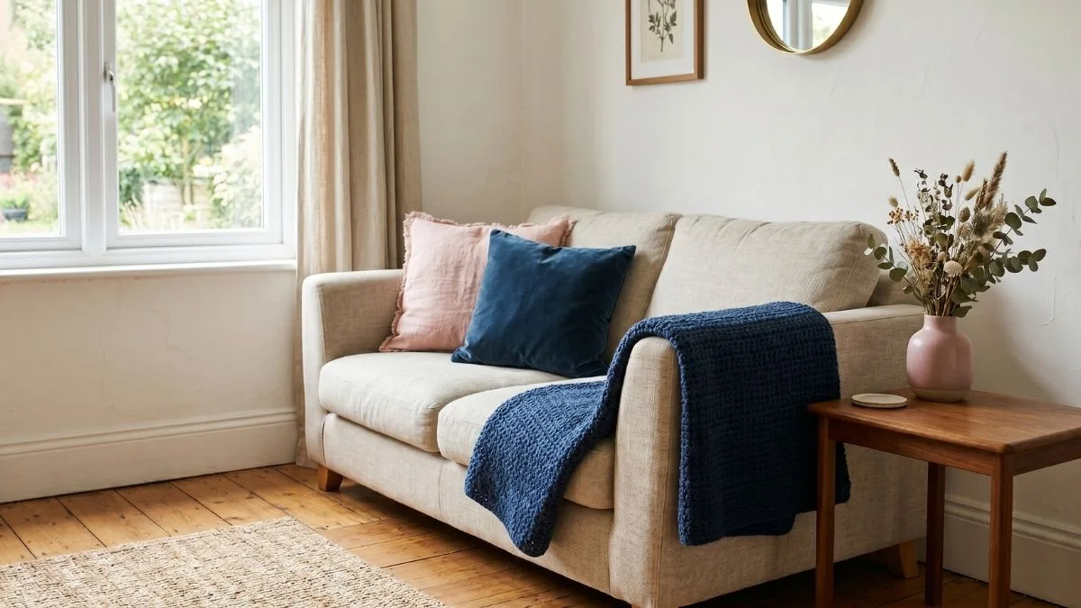
2. A Crochet Throw Blanket That Mixes Both Tones
A throw folded over the end of a bed or draped across a sofa arm carries both colours at once without needing to match anything else in the room. A striped or granny-square pattern lets moody blue and vintage pink sit side by side rather than blending into a muddy middle tone, and the texture reads warmer than a flat woven blanket.
Yarn weight changes the mood: a chunky gauge feels casual and current, a finer one closer to an heirloom piece. If a particular pattern appeals to you, a skilled local artisan can replicate it in the exact yarn weight, proportions, and colour balance that suit your own sofa or bed.

3. Velvet and Linen Cushion Covers, Layered Not Matched
Cushions are the cheapest, fastest swap on this list, which makes them the easiest place to test the pairing before going further. Mixing textures, a velvet moody blue cover next to a linen vintage pink one, stops the combination from feeling flat the way two covers in the same fabric tend to.
An odd number works better than an even one: three covers in varied sizes (two square, one lumbar) give the eye a rhythm to follow instead of a symmetrical block. One solid colour plus one subtly patterned cover, rather than two solids, adds depth without looking busy.

4. A Vintage-Pattern Rug in Moody Blue
A rug is the largest colour move on this list that still avoids paint, and because it sits at floor level, it tends to read as the most settled, least decorative piece in the room. A vintage-style pattern — an Oushak or Persian-inspired motif, in particular — carries moody blue at a lower saturation than a solid rug would, which keeps it from competing with furniture above it.
Layering a smaller patterned rug over a larger plain jute or wool one is a common way to bring in pattern without covering the whole floor in colour, and it’s easy to swap out later if the room’s mood changes.

5. Ceramic Vases in Both Glazes for Everyday Blooms
A pair of vases, one in a crackled dusty pink glaze and one in a deeper blue, gives a shelf or console table a colour anchor that costs far less than almost anything else on this list. Reactive or crackle glazes catch light differently through the day, which makes a still object feel less static than a flat-painted one would.
Grouping vases at varying heights, rather than matching pairs, reads as gathered over time instead of bought as a set. Filled with dried stems or whatever is in season locally, they need no upkeep and can move between a console table, a kitchen windowsill, or a bedside table as needed.

6. A Small Gallery of Framed Prints in the Same Palette
Two or three framed prints, rather than a full wall of them, repeat moody blue and vintage pink at eye level so the palette feels intentional instead of scattered only across small objects. The mat board colour inside the frame changes how saturated the print reads: a cream mat softens vintage pink, while a charcoal mat makes moody blue feel deeper.
Leaning frames on a shelf or a picture rail, instead of drilling directly into the wall, keeps the arrangement easy to change and works well in a rental.

Most rooms only need two or three of these six ideas, not all of them at once — a throw and a pair of vases can carry the palette just as convincingly as a full room overhaul. Designers tracking 2026’s colour direction note that historically grounded, vintage-leaning palettes read as considered rather than trend-chasing, especially when they arrive through textiles and small objects rather than a wall. Nothing here involves a tin of paint, so every choice on this list stays easy to undo.
A Note on Colour and Light
Paint swatches, fabric samples, and wallpaper panels can all look noticeably different by lamplight than they do in a shop or on a screen — moody blue in particular shifts between cool and almost black depending on the hour. Before committing to a piece, hold it near a window in the morning and again after dark with the lamps on. The shade that still feels right in both lights is the one worth keeping in the room.