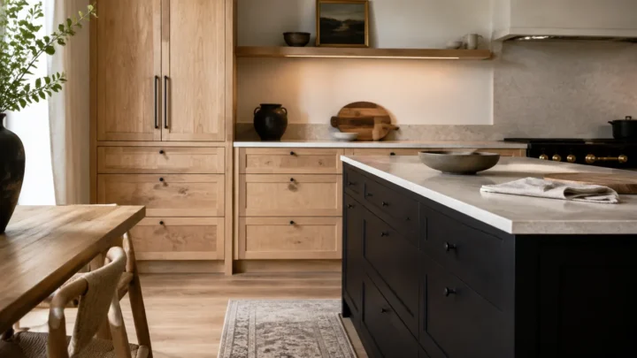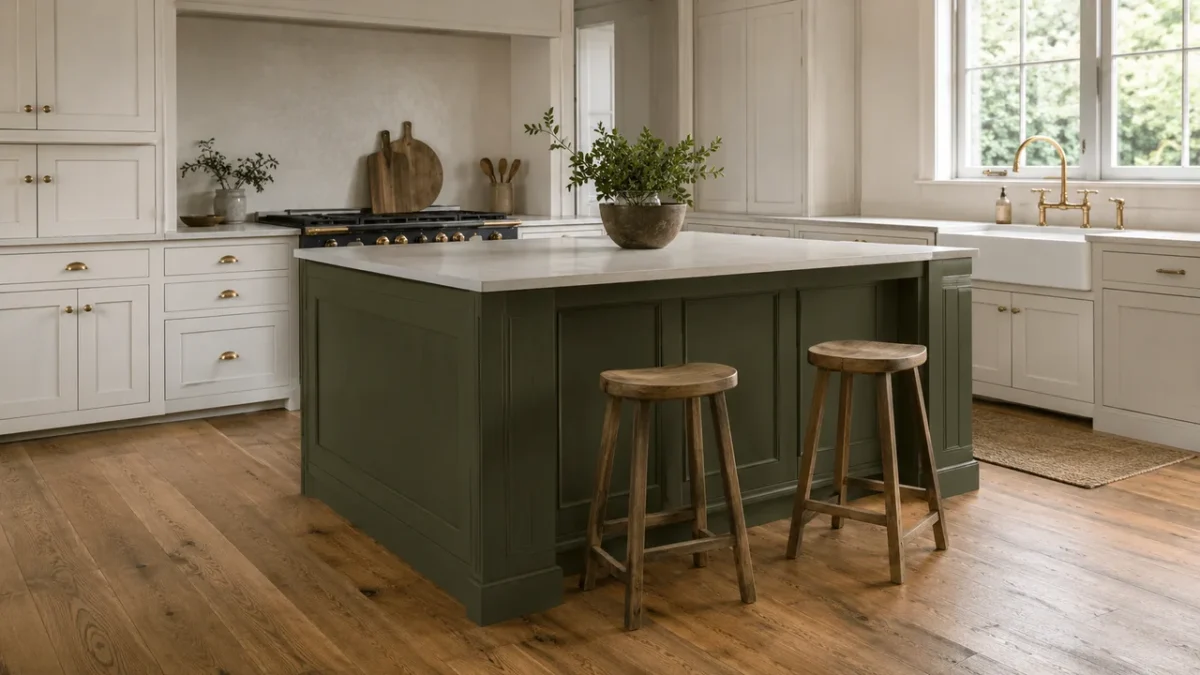
A full cabinet repaint is a major visual commitment. If the perimeter cabinets still suit the room and the countertop, backsplash, and floor are in good condition, painting only the kitchen island may give the space the contrast it has been missing.
The island is already a natural place to concentrate color. In the NKBA’s 2026 Kitchen Trends Report, 57% of the surveyed industry professionals expected new statement color to appear on the island. Neutrals still led the broader kitchen palette, while greens and blues were the strongest non-neutral families. That combination explains the appeal of an island-only update: the room can keep its quieter envelope while one central surface carries more depth.
Paint is enough only when the problem is color balance. It will not repair peeling veneer, delaminating thermofoil, loose doors, a damaged coating, or an island that no longer works for the household. Treat those as repair or layout questions before choosing a shade.
When an island-only refresh can change the room
A contrasting island works best when the kitchen already has a stable background. The perimeter cabinets do not have to be white; natural oak, walnut, putty, cream, and soft gray can all provide the quieter field around a painted center.
- The fixed surfaces already coordinate. The counter, backsplash, floor, and perimeter cabinets look intentional together, but the room lacks a visual anchor.
- The island feels detached. It may be the same pale color as everything else, or its wood tone may sit awkwardly between the floor and cabinetry.
- You want to keep visible wood. Painting the island can introduce color without covering an entire run of grain.
- The adjoining room needs a clearer connection. A carefully chosen island color can pick up a muted tone already present in the flooring, stone, or nearby furnishings.
If the whole cabinet run needs a new direction, the broader guide to kitchen cabinet color ideas for 2026 covers full-room options. This guide keeps the decision deliberately narrower: one island, the existing fixed finishes, and the way the color behaves in the actual room.
The WA 4–3–2 Island Color Test
A small chip held beneath a showroom light cannot approve an island color. Make at least one large movable sample board—ideally 12 by 18 inches or larger—and use the proposed cabinet coating and sheen when possible. Then put every finalist through the same test.
4 fixed surfaces: Compare the sample directly with the countertop edge, perimeter cabinets, floor, and backsplash. A good island color does not have to match them, but it should not introduce an unexplained pink, green, yellow, or blue undertone.
3 light moments: Check the room in its clearest natural light, its dimmer daytime light, and with the evening fixtures you actually use. Move the board from a bright end panel to the shaded seating side; deep colors often change most beneath the counter overhang.
2 viewing distances: Inspect the sample at arm’s length for undertone, sheen, and surface quality, then read it from the doorway or adjoining room. Up close, the color must work with the materials. From farther away, the island should look like a deliberate anchor rather than a dark block or a near-match that missed.
A finalist passes when it remains compatible with all four fixed surfaces, recognizable through the three light conditions, and balanced at both distances. If it turns black at night, clashes with the counter edge, or disappears into the perimeter cabinetry, adjust the depth or undertone before buying more paint.
7 kitchen island paint colors for a one-surface refresh
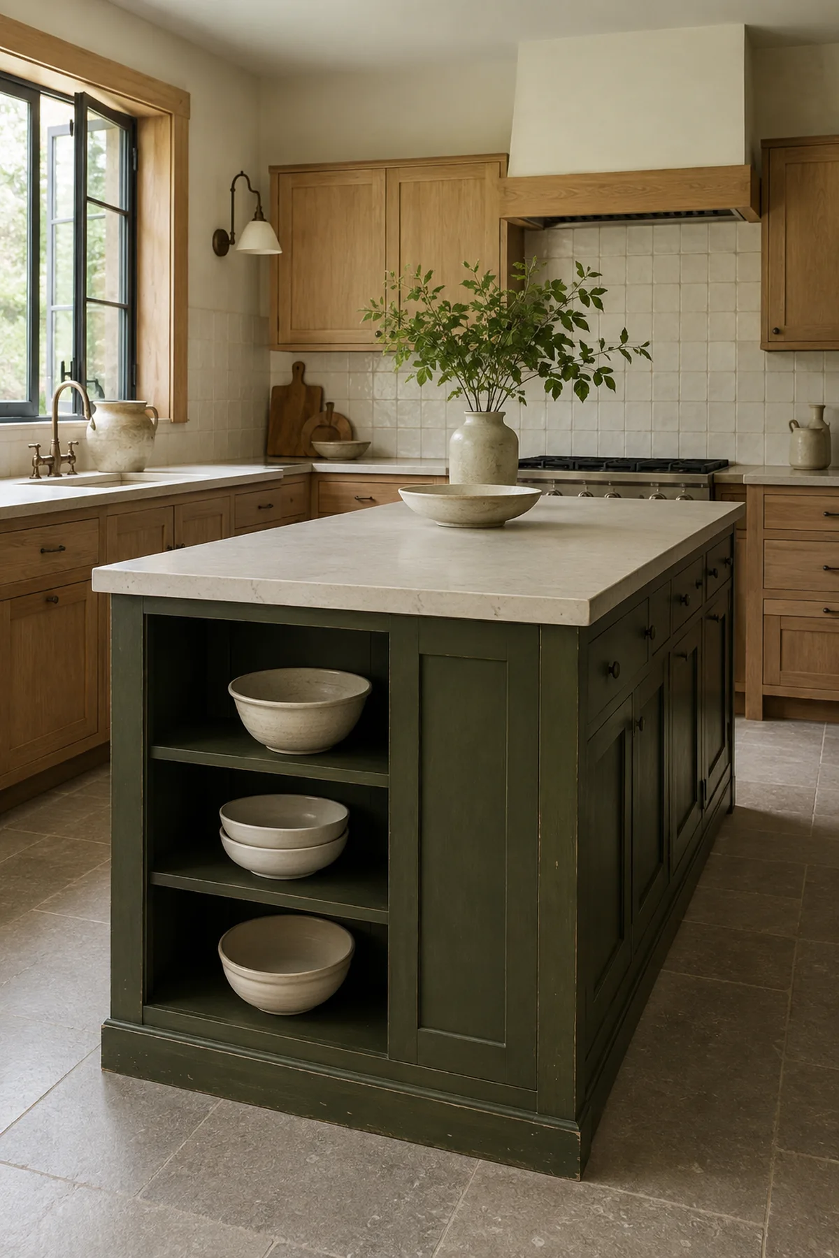
1. Smoky olive green
Smoky olive is one of the easiest ways to give a pale kitchen weight without making it feel formal. Its muted yellow-green base can connect warm white cabinets, white oak, aged brass, and cream stone while still reading as a true color.
Works best with: warm white or bone cabinetry, oak with a quiet grain, creamy quartz, limestone tones, and medium wood floors.
Watch for: a strongly yellow counter or orange-toned floor. Beside both, olive can become murky. Compare a grayer olive and a slightly bluer one before deciding.
If wood, counter, and backsplash are still being selected, use the guide to countertop and backsplash pairings for warm-wood kitchens before treating paint as the bridge between unsettled materials.
2. Inky muted blue
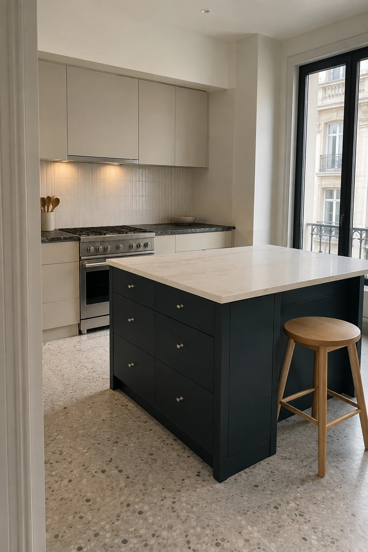
An inky blue gives the island a clean outline, but the best version is softened enough to remain blue after sunset. Look beyond clear navy toward a smoke-gray or subtle green-blue undertone; it tends to sit more naturally beside wood and warm stone.
Works best with: warm-white or putty perimeter cabinets, pale oak, restrained cream counters, brushed nickel, and stainless steel.
Watch for: the shaded seating side. A sample that looks nuanced near a window may become a flat black band beneath the overhang. If that happens, move one or two steps lighter rather than adding brighter bulbs solely to rescue the paint.
3. Mushroom taupe
Mushroom taupe is useful when the room needs separation more than drama. It can calm a kitchen with visible stone movement or a warm, varied floor because it adds value contrast without introducing a loud new hue.
Works best with: ivory cabinetry, limestone or travertine, warm gray veining, reclaimed brick, and mixed beige-brown floors.
Watch for: a near-match with the perimeter cabinets. Two taupes that are almost the same can make the island look like a color error. Choose a clear difference in depth, then check that the undertones still belong together.

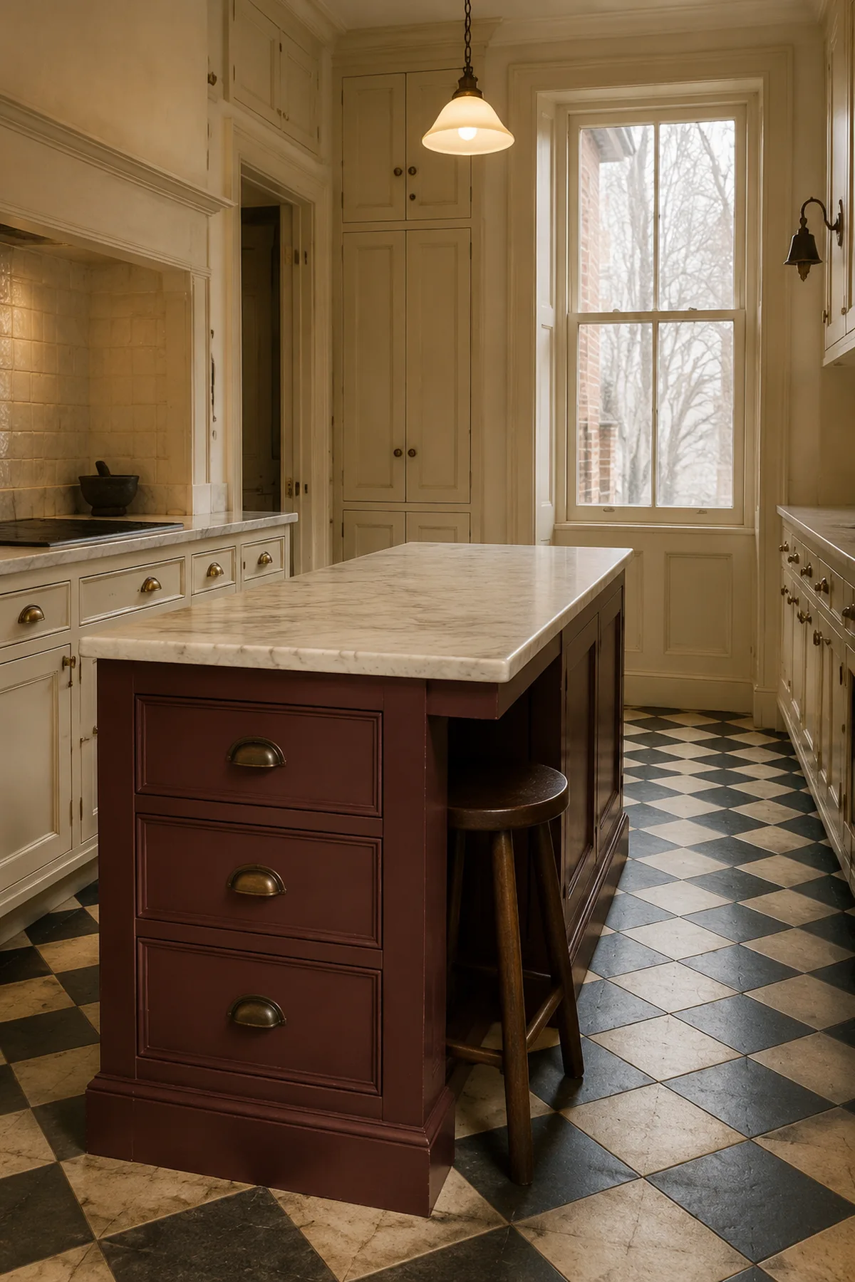
4. Muted burgundy or oxblood
A browned burgundy brings warmth and definition without the sweetness of bright red or the purple cast of aubergine. Used on the island alone, it can feel grounded and traditional in one kitchen, then unexpectedly tailored in a simpler modern room.
Works best with: warm ivory, walnut, creamy marble or quartzite, aged brass, and dark wood floors.
Watch for: cherry cabinetry, red oak, or a strongly pink stone. Too many red families can make each surface look more saturated. Hold the sample beside the wood at midday and after dark; the relationship should feel layered, not competitive.
5. Espresso charcoal
Espresso charcoal is the softer alternative to a true black island. Brown or umber beneath the charcoal keeps the color connected to timber, while the dark value still gives pale cabinetry a firm center.
This direction also fits the current move toward more complex dark neutrals. The Benjamin Moore Color Trends 2026 palette, for example, centers a deep burnt-umber-and-charcoal shade and pairs it with clay, tan, teal, and lifted neutrals. Treat such palettes as direction, not proof that one exact paint will suit your kitchen.
Works best with: pale oak, warm-white cabinetry, ivory counters, off-white handmade tile, and medium-tone floors.
Watch for: piling on black hardware, black pendants, black window frames, and black stools. If the island is the anchor, it does not need every small detail to repeat it. For a wider material strategy, see how to keep a white-oak-and-black kitchen warm.

6. Softened clay or terracotta
Clay works when it looks mineral rather than orange. A dusty, browned terracotta can warm quiet putty cabinets and pale stone, especially in a kitchen where natural light keeps the color from becoming heavy.
Works best with: bone white, putty, muted green-gray, travertine, limestone, and simple oak details.
Watch for: honey oak, orange brick, or a strongly rust-colored floor. The island should not become a fourth version of the same warm note. Test a more muted or slightly rosier clay if the existing materials already lean orange.

7. Buttercream yellow
Buttercream is the lightest idea in the group, yet it can still separate the island from warm-white cabinets. The useful version is pale, chalky, and slightly muted—not lemon, neon, or a saturated farmhouse yellow.
Works best with: warm white, soft gray, maple or pale oak, charcoal slate, creamy counters, and simple nickel or aged-brass hardware.
Watch for: warm evening bulbs. A gentle daytime yellow can turn orange under very warm artificial light. Check the sample after sunset and beside the white cabinetry; if both look unexpectedly dirty, the undertone relationship is wrong.

Prep matters more when one surface carries the color
A central island receives hands, stool impacts, shoe marks, crumbs, and repeated wiping. Ordinary wall paint is not the right shortcut. Use a coating intended for cabinets, doors, or trim, and follow the exact product system for the island’s substrate.
The sequence in Sherwin-Williams’ kitchen-island painting guide is a useful baseline: remove the hardware, protect the counter and floor, degrease, allow the surface to dry, scuff-sand the wood, prime, check adhesion, and then paint. That does not make one primer or sanding method universal. Factory finishes, laminate, stain-prone wood, and an unstable existing coating can require different preparation.
- Inspect before sanding. Repair loose edges, peeling veneer, chips, and failed coating first. If the surface is thermofoil or laminate, confirm that it is sound and use a system approved for that material.
- Label every door and piece of hardware. Remove doors and drawer fronts when the construction allows, then keep hinges and screws organized so alignment does not become the final problem.
- Choose the finish as part of the sample. Satin usually gives a quieter reflection; semi-gloss shows more light and can emphasize imperfect prep. Product formulation matters more than the sheen name alone.
- Respect dry, recoat, and cure times. A coating can feel dry while remaining vulnerable to fingerprints, sticking doors, stool knocks, and cleaning. Follow the manufacturer’s current return-to-service instructions.
- Do not add a clear topcoat automatically. Many cabinet enamels are designed to be the finish coat. An incompatible clear product can change the color, sheen, or adhesion.
Kitchen island color questions
Should a kitchen island be darker than the cabinets?
No. A darker island is an effective way to add contrast, but buttercream, pale blue-green, and lighter taupe can also work when the perimeter cabinetry is deeper. The island needs a deliberate difference in hue, value, or both—not a mandatory dark finish.
Does the island color need to repeat elsewhere?
Not necessarily. A small repeat in artwork, fabric, or ceramics can connect an open-plan room, but repeating the color in every pendant, stool, and accessory usually weakens the clarity of the single painted surface. Let the island be the one strong note if the fixed materials already support it.
Can a laminate or thermofoil island be painted?
Some stable laminate surfaces can be painted with the correct preparation and bonding system. Peeling or delaminating thermofoil is a different problem; paint should not be used to glue a failing layer back into service. Identify the substrate and follow coating-manufacturer guidance or use a qualified refinisher.
How large should an island paint sample be?
Use the largest movable sample you can handle comfortably; 12 by 18 inches is a practical starting point, while a full spare door or large panel reveals more. A tiny chip is useful for narrowing a family, not approving the final color.
Before you paint: The kitchens shown here are original styling concepts for color planning, not product listings or promises of an identical result. Screens and photography shift color, so approve a physical sample in the intended coating and sheen. If sanding may disturb paint in a U.S. home built before 1978, review the EPA’s lead-safe renovation guidance before starting; local requirements outside the United States may differ.
If one finalist passes the 4–3–2 test and the rest of the kitchen is sound, stop there. The restraint is what lets a one-surface refresh look intentional.