The new luxury room on Pinterest does not look sealed under glass.
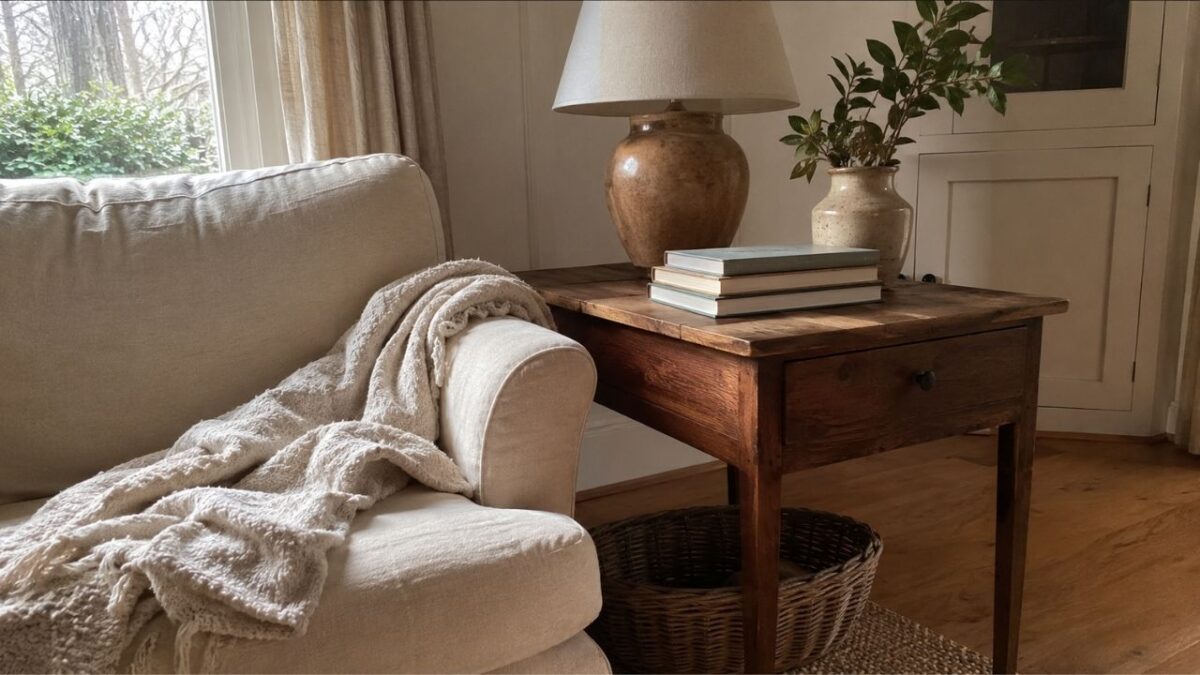
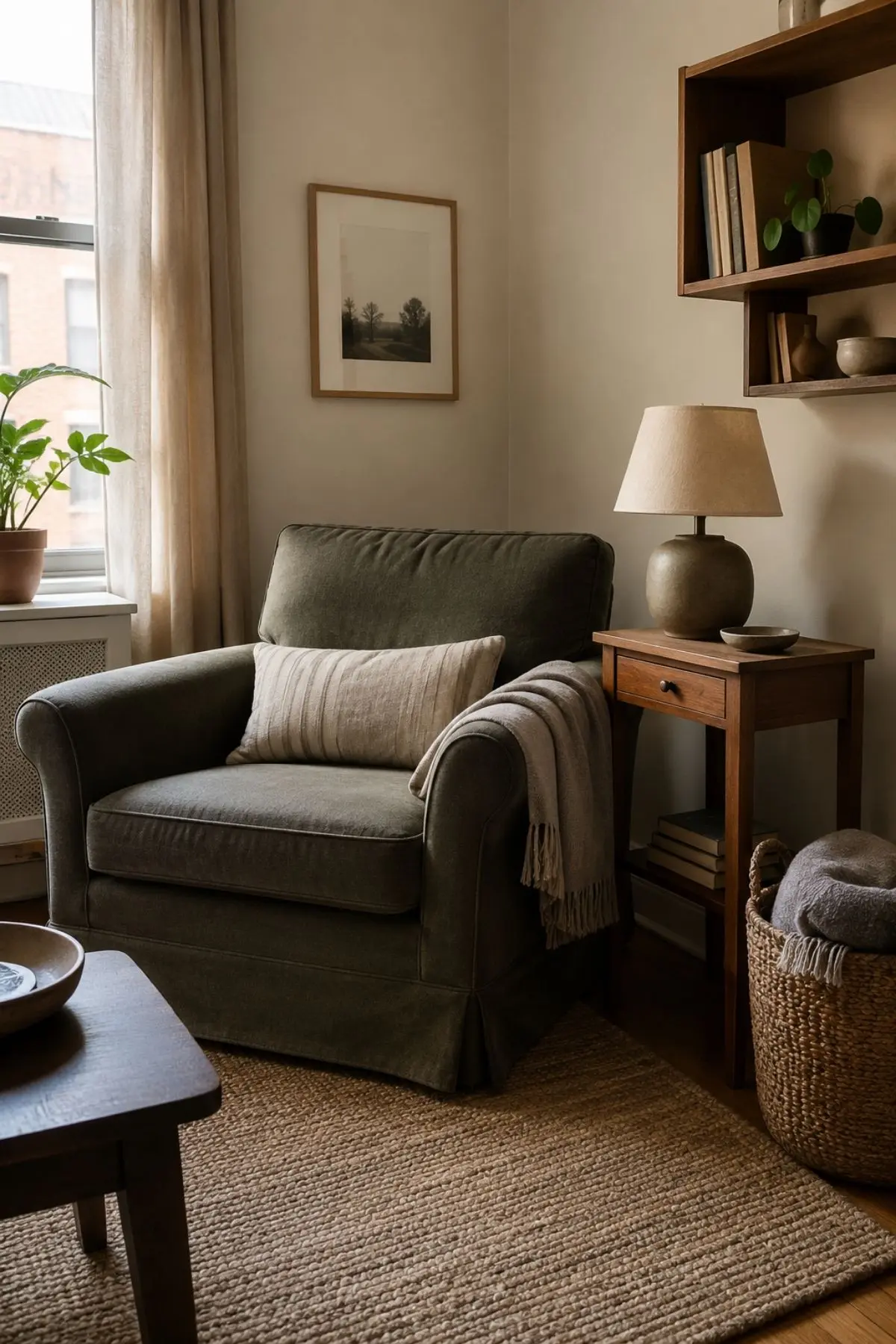
It has a linen cushion that is slightly crushed. A wooden side table with a little patina. A reading chair near the window. A shelf that holds books, ceramics, a basket, and one small object that looks as if it has been kept for years.
In 2026, that kind of room feels more current than the perfectly polished showroom look.
The shift is already showing up in search behaviour. In Pinterest’s Spring 2026 Trend Report, searches for “comfy reading chair small spaces” rose by 455%, while “reading nook ideas” climbed by 245%. The same report points to warm, nostalgic, and textured home searches, from “warm wood kitchen” to “dark cottagecore kitchen” and “grandma core kitchen.”
That does not mean every home needs to look old-fashioned.
It means people are saving rooms that feel softer, warmer, and more personal. The expensive-looking room is no longer just about marble, shine, or perfect symmetry. It is about comfort with taste.
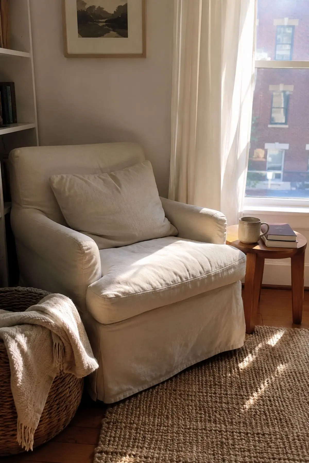
The new Pinterest luxury is emotional, not flashy
For a long time, online interiors were dominated by rooms that looked untouched.
White sofas. Empty counters. Matching furniture. Smooth surfaces. No sign of daily use.
That look still photographs well, but it can also feel distant. Soft, lived-in rooms work differently. They make the viewer imagine sitting down, opening a book, folding a blanket, or placing a cup on the table without worrying that the whole room will lose its balance.
This is why the trend matters.
It is not messy. It is not careless. It is a more human version of polish.
House Beautiful’s 2026 design coverage described the current mood as rooms that feel “collected rather than curated”. That phrase explains the visual shift perfectly. People still want beauty, but they want beauty that looks usable.
What makes a room feel softly lived in?
A soft, lived-in room usually has five things working together.
First, it has touchable texture. Linen, cotton, wool, rattan, wood, ceramic, soft upholstery, woven trays, and paper lampshades all help a room feel warm without making it look crowded.
Second, it has gentle imperfection. A rumpled throw can look better than a perfectly folded one. A vintage table with small marks can feel richer than a brand-new piece with a glossy finish.
Third, it has warm light. Not harsh overhead brightness, but small pools of light from table lamps, wall lights, or a shaded floor lamp.
Fourth, it has personal rhythm. Books, framed prints, handmade details, a small bowl, a favourite chair, or small handmade decor pieces can make the room feel gathered over time.
Fifth, it has breathing space. The lived-in look fails when every surface is filled. A room can be layered and still calm when each object has a reason to be there.
Why warm wood is suddenly important again
One of the biggest signs of this shift is the return of brown wood.
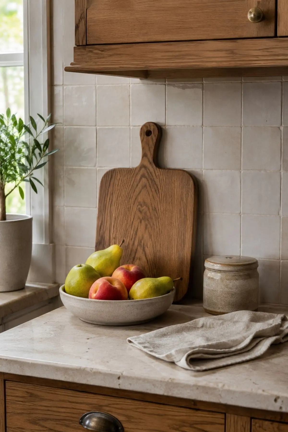
For years, many homes moved toward pale grey, flat white, and very light oak. Now darker and mid-tone woods are starting to feel fresh again because they bring depth, age, and visual warmth.
Real Simple recently reported that designers are bringing back brown-wood furniture, especially when vintage or antique pieces are mixed with modern decor rather than used as matching sets.
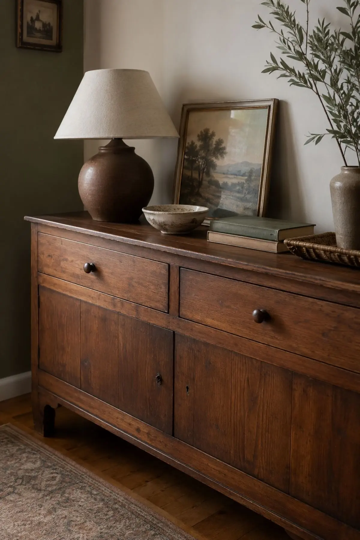
This is an important distinction.
The new look is not a heavy room full of dark furniture. It is one deeper wood piece against softer materials: a walnut sideboard with a linen lamp, a vintage chair beside a pale rug, or a wooden coffee table under a loose stack of books.
The contrast is what makes it feel current.
The colour palette is warmer, but still calm
Soft, lived-in rooms do not need loud colour.
They often begin with warmer neutrals: oat, cream, parchment, mushroom, taupe, clay, soft brown, muted olive, dusty blue, or butter yellow.
Houzz’s 2026 home design trend report also points to warmer, earthier interiors, noting that stark white and icy grey palettes are giving way to shades such as terra cotta, sage, olive green, creamy beige, brown, taupe, and buttery yellow.
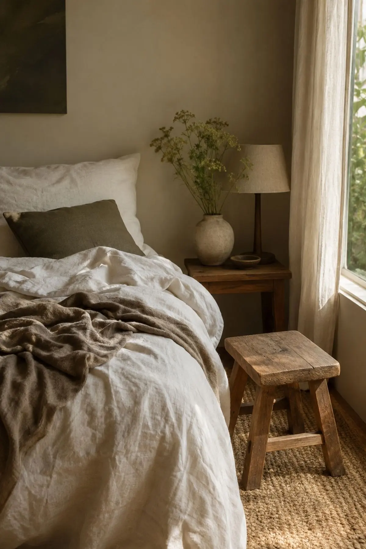
That palette works well because it lets texture do most of the work.
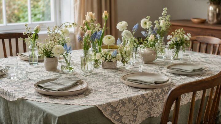
A cream room can feel flat if every surface is smooth. But add a woven rug, a wooden stool, a linen cushion, a ceramic vase, and a soft patterned throw, and the same palette suddenly feels layered.
The trick is “soft order”
The lived-in look can go wrong when it becomes visual noise.
The goal is not to leave everything out. The goal is soft order.
Soft order means the room has small signs of use, but the eye still knows where to rest.
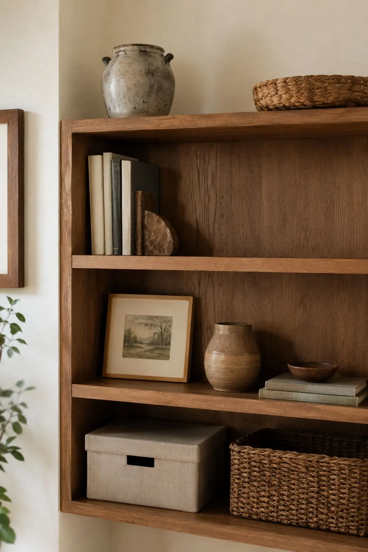
Try this simple rule: one relaxed textile, one warm wood piece, one useful tray or bowl, one reading or sitting point, and one empty surface.
That empty surface matters.
It keeps the room from feeling like a storage corner. It also makes the personal details look intentional rather than accidental.
Small rooms may be the best place to try it
This trend works especially well in smaller homes and apartments.
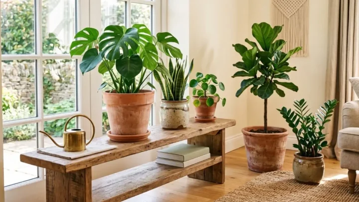
A lived-in room does not need a large budget or a full redesign. It can start with one corner: a chair, a small lamp, a side table, a textured cushion, and a stack of books.
That is one reason Pinterest’s reading nook searches feel so relevant. A reading corner is a tiny version of the whole trend. It is personal, useful, soft, and easy to photograph.
The same idea works in an entryway, bedroom corner, kitchen counter, or dining nook.
A small apartment living room can feel more refined when the styling looks practical instead of staged. A basket can hold throws. A tray can gather small items. A shelf can mix closed storage with a few visible pieces.
What to avoid if you want the look to feel expensive
A soft, lived-in room should not look like a random pile of beige objects.
Avoid buying too many “cosy” accessories at once. Too many new items in the same colour can make a room feel artificial.
Avoid plastic-looking finishes when the room depends on softness. Glossy faux wood, overly smooth synthetic fabrics, and shiny decorative objects can break the mood quickly.
Avoid styling every cushion perfectly upright. Rooms often look more believable when one cushion is slightly lower, one throw is gently folded, and one book is open on a side table.
Avoid copying a trend too literally. The most interesting lived-in rooms do not look like they came from one shopping cart. They look as if the owner made careful choices over time.
The Women’s Alphabet soft-room formula
For a room that feels soft, current, and not overdone, use this formula:
- One grounding texture: a woven rug, linen curtain, boucle chair, or wool throw.
- One warm wood note: a side table, stool, shelf, frame, or cabinet.
- One personal layer: books, ceramics, framed art, or a handmade object.
- One practical detail: a tray, basket, lamp, or storage box that actually helps the room function.
- One quiet gap: a surface or corner that is left clear so the room can breathe.
This is where the trend becomes useful.
It does not ask for a perfect home. It asks for a room that feels considered. A room can be simple, modest, and still beautiful when the textures, colours, and objects feel honest together.
That is also why soft, lived-in rooms are becoming the new Pinterest luxury. They photograph beautifully, but they do not depend on perfection. They feel warm without being loud, personal without being chaotic, and polished without looking untouchable.
The new luxury is not a room that looks too precious to use.
It is a room that looks calm enough to stay in.
Editorial Note
Women’s Alphabet does not sell the rooms, furniture, decor pieces, or styling items shown or described in this article. The visuals and ideas are shared as editorial inspiration only. They should not be treated as product listings, purchase offers, or exact DIY instructions.